Yesterday, I wrote about the quiet satisfaction of the build—how the learning curve and the process of bringing an idea to life is often more rewardingly meaningful than its final utility. If that is true, then documenting the process is the natural next step. It’s about showing the gears turning, sharing the raw artifacts without the “filter” of marketing copy or design perfection.
Lately, I’ve been return-visiting the White Papers project. It’s a collection of essays and strategic frameworks for ideas I believe have the potential to become real, or at the very least, to inspire others to look at physical and digital spaces differently. One of these papers is Walk-a-Film.
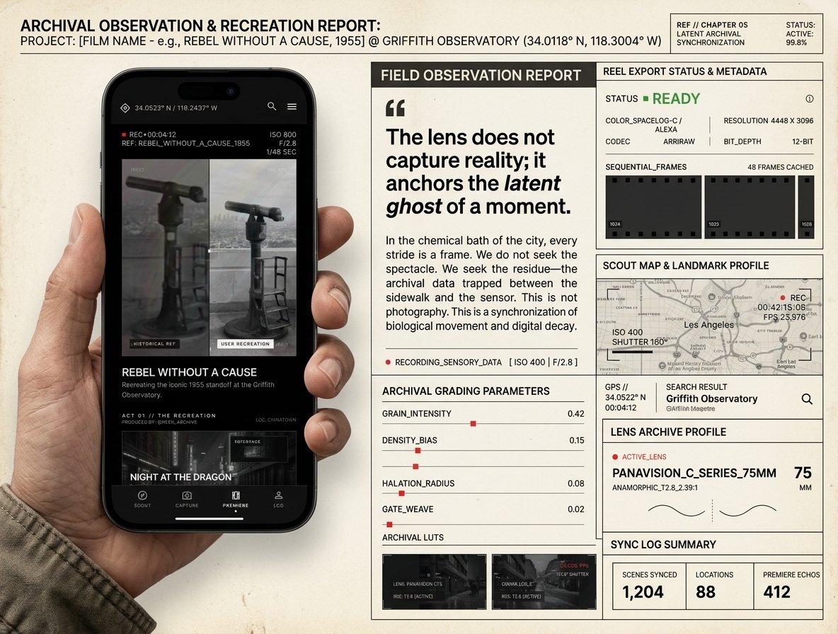
Today, I’m opening up the project folder to share a set of app mockups that were created based on the Walk-a-Film concept.
What is Walk-a-Film?
For context, *Walk-a-Film* is a strategic blueprint that treats the entire city of Los Angeles not as a static tourist destination, but as a living, interactive cinema museum, specifically designed for the 2028 Summer Olympics.
With millions of visitors expected to descend on LA, the city faces a massive logistical challenge. The Olympic mandate rejects new permanent construction, calling instead for radical reuse. Walk-a-Film addresses this by creating “weightless monuments”—augmented reality overlays that require zero concrete but connect visitors directly to the city’s cinematic soul.
Through a simple mobile viewport, users can align their camera with historical film stills and step directly inside iconic movie scenes. They can stand in the exact footsteps of characters from classics like Rebel Without a Cause at the Griffith Observatory, or look up at Nakatomi Plaza from Die Hard.
By mapping these experiences across hundreds of coordinates throughout the LA basin, the platform acts as a crowd-distribution tool, encouraging tourists to explore and spend money in historic neighborhoods they might otherwise bypass.
The Technology: Beyond GPS
To make this convincing, we had to go beyond standard GPS. A typical phone’s GPS has an error margin of three to five meters—imprecise enough that a movie overlay would look like a cheap digital sticker floating in space.
Instead, Walk-a-Film uses a custom computer vision pipeline (orchestrated by Flash Creative House to match visual anchors in the environment (like rooflines and retaining walls) with sub-five-centimeter precision. The app then warp-scales the perspective of the archival film frame to match the user’s height and lens focal length, creating a seamless “Dissolve Mechanic” where the past and present merge.
Real-time lighting filters analyze the sun’s direction, shadows, and color temperature, blending the user’s camera feed with the specific contrast, grain, and color grading of the film’s era.
The Mockups: Nordic Noir Aesthetic
To visualize how this looks in practice, I designed these app mockups. I chose a sleek, high-contrast, atmospheric “Nordic Noir” aesthetic. Sharing these screens here—no filter, raw, archival. It’s cool to document the progress.
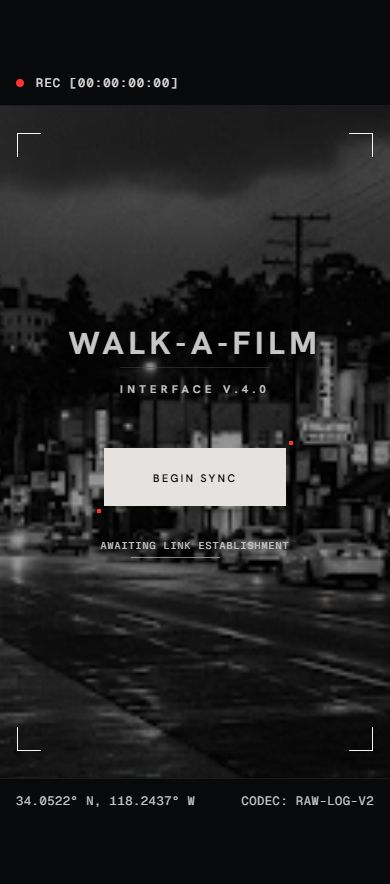
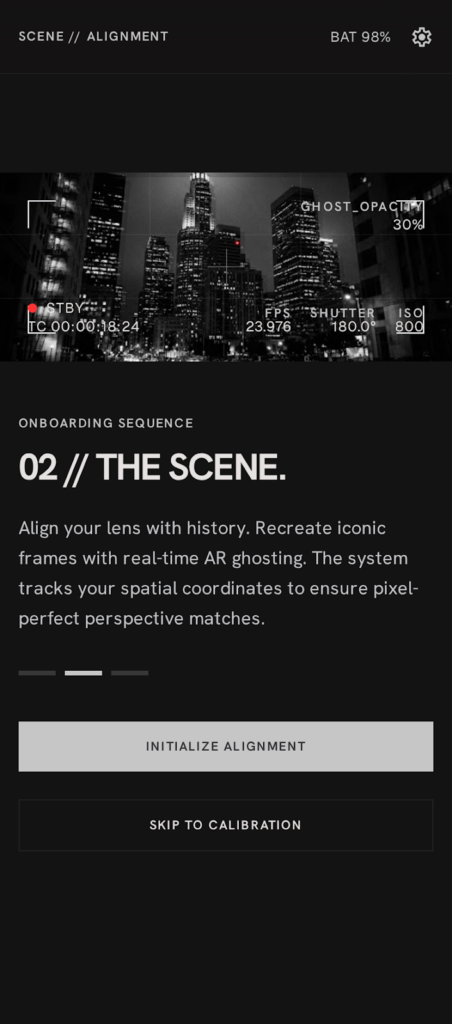
1. The Onboarding Journey
The onboarding screens introduce users to the core loops of the experience: discovering a scene, scouting the coordinate, aligning the perspective, and capturing the moment.
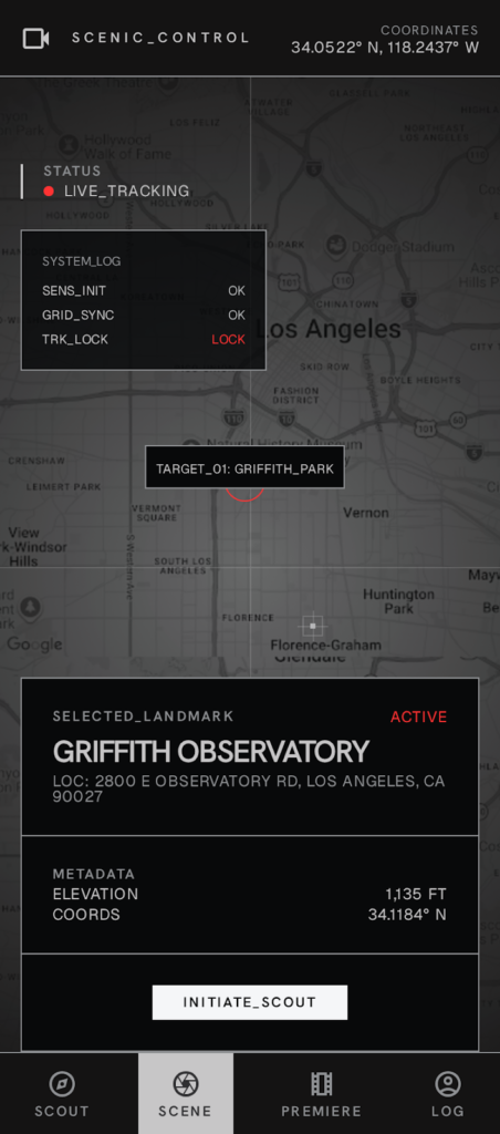
2. The Map Interface
A dark, high-contrast geographic overview that maps celluloid memory coordinates across the city, encouraging exploration.
3. The Superposition & Alignment
The core interface where the user aligns their camera feed with the historical frame using visual guides.
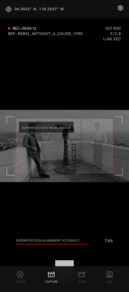
4. The Shareable Keepsake
Once aligned, the app exports a high-quality cinematic composition, letting the user step side-by-side with characters or transition between past and present.
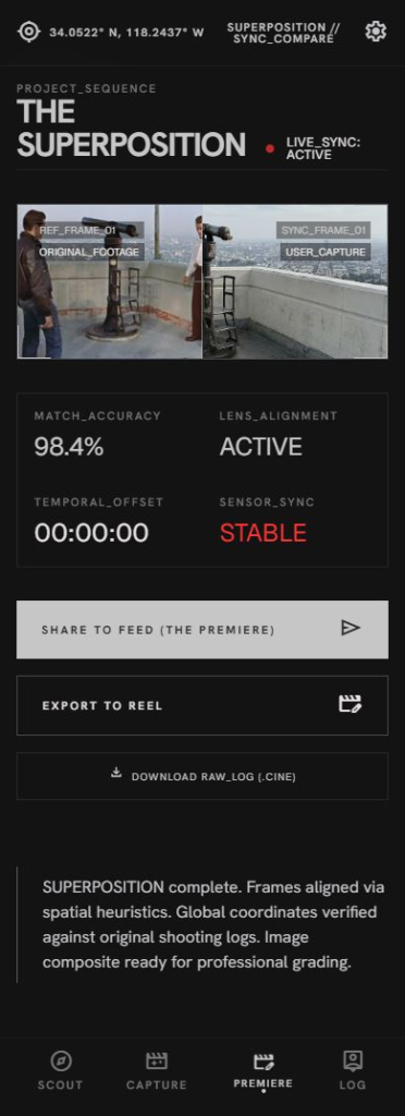
5. The Director’s Log
A personal diary tracking the user’s journey, walk-through logs, and unlocked scenes.
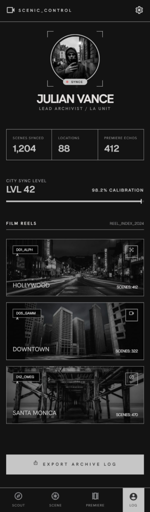
The Next Step
Right now, the original Walk-a-Film paper relies entirely on text and code-driven layouts to convey its strategy. The idea now is to take some of these mockups and integrate them back into the white paper itself to give the concepts a clear, visual anchor.
Sharing the process here is part of keeping the studio open. It is a reminder that the messy middle of designing—the mockups, the styling decisions, the files in the directory—is just as important as the final product.
Leave a Reply